Tuesday, March 11, 2014

Excel Formulas


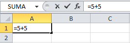
We use Excel formulas to perform calculations using data and we could updated whenever we want to change it. An Excel formula is a special code we put in a cell. This code performs some calculations and returns a result that is displayed in the cell. 

There are millions of variations of formulas because each person will create the formula that best suits their specific needs. All must follow the same rules especially a rule that all formulas must start with an equal sign (=).


Símbolo igual en las fórmulas de Excel


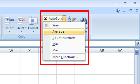
There are basic formulas that we can use like sum, average, count numbers, max, min, etc.


SUM
The sum function provides a quick way to sum colums or rows of numbers in an Excel worksheet. As well, if data is later changed or numbers added to blank cells in the range, the total automatically updates.


Average

If you're trying to work out an average, you're trying to calculate what the most common value is. In Excel , there is an easy way to calculate the average of some numbers just use the inbuilt Average function.


Finally here is a video that will help you to understand better how to create formulas on excel


http://www.youtube.com/watch?v=EbBMHF-GJCU


Excel Graphs

There are a lot of graphs in excel that could help you to organize your information and have a better idea of the data that you gained.

Some exameples of graphs are: bar graph, pie graph,   line graph,  scatter plot graph, column graph, area chart, stock chart, doughnut chart, bubble chart, etc.


The graphs more use are the bar graph, line graph and finally the pie graph.

Bar Graph

Bar graphs are most often used to show amounts or the number of times a value occurs. The amounts are displayed using a vertical bar or rectangle. The taller the bar, the greater number of times the value occurs.
Line Graph
Excel Line Graph
Line graphs are often used to plot changes in data over time, such as temperature changes or daily changes in stock market prices. They can also be used to plot data recorded from scientific experiments.

Pie Graph
Excel Pie Chart
The circle of pie charts represents 100%. The circle is subdivided into slices representing data values. The size of each slice shows what part of the 100% it represents. Pie charts can be used anytime you want to show what percent a particular item represents of a data series.
How to create a graph?

1. First go to the top of the page in excel
2. Click on Insert
3. Look for Charts
4. Finally choose the graph that you like the most

Finally, I would use this graphs or charts to have a better idea of the results that I gain. It is important because you can organize the information in a better way. There are a lot of possibilities that you can choose to do a project or a presentation so that you can organize the data in a better way.  I also would use them because I can do comparisons between the results that I have and make conclusions.


Here is a video that will help you to create your own graphs


http://www.youtube.com/watch?v=xlWQRtUpuXo